Brightburn Social Animation

Hunger Games: The Ballad of Songbirds and Snakes

GutLunch

LIFEHONEY

Morbius Social

Once Upon A Time In Hollywood Concept

Most Dangerous Animal of All

Dope Teaser Trailer

Accessible Film Festival 2017

International Short Film Festival 2010
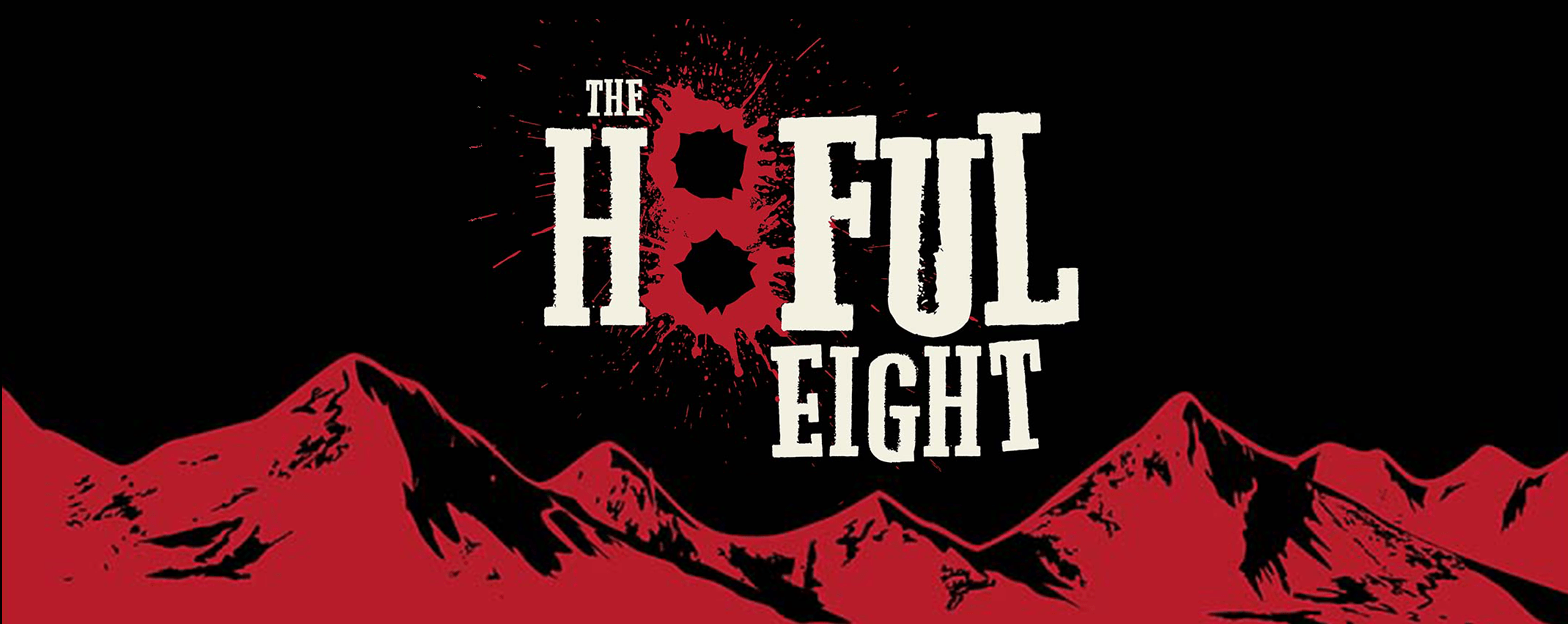
Hateful 8 Teaser

International Short Film Festival 2013

Next 10 Ventures Website Illustrations

The Craft
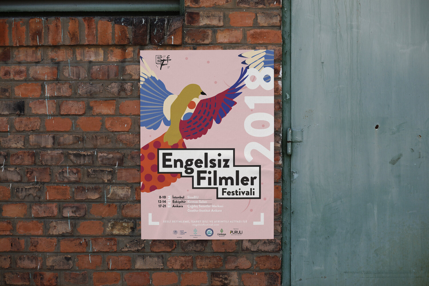
Accessible Film Festival 2018

Right Idea Wrong Time

Punanimation Triangle Animation

Walking Dead Social Pieces

Onlooker

Quentin Tarantino's #9